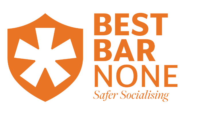
| At the recent Best Bar None Conference, the national team announced the re-branding of Best Bar None. Why has it changed? Here's what the national Best Bar None team had to say: One of the scheme aims is to demonstrate and reassure the public of a safe and enjoyable time. The demographic that expresses most concern in this area is, understandably women, and mostly young women. The old logo held zero appeal to this audience. The previous logo was old fashioned, and we understand this to be one of the reasons that the national sponsors, who are very high profile, do not actively promote the brand and their support of it. With the new logo sitting much better alongside national sponsors we are hopeful they will proudly display their support of the scheme, obtaining that national marketing reach everyone has been telling us for years they would like to see. The previous logo was adapted to be town/city specific, we believe the better approach is to have a stand-alone, uneditable logo and then advise local schemes on how they can personalise around that. We feel that the new logo creates a brand identity which:
The national team wanted the logo to communicate at a glance that the accredited venue is gold standard operationally and is focused on ensuring safer socialising in their premises. The shield is an internationally recognised symbol of safety and the accompanying star shape, a symbol of gold standard. 'Best Bar' is emboldened to highlight the standard that needs to be achieved to gain the accreditation. The font used is a Sans-Serif Bold, an authoritative font that is clear and easy to read at a glance, even when the logo is scaled down to a very small size. We hope you'll agree that the re-branding gives the scheme a fresh new look which reflects our shared goals of delivering safer socialising and will assist in informing our communities what Best Bar None accreditation means. |
Comments